


1912 London Underground Pocket Map 'London's Guiding Star' - First Underground Logo
London’s Guide Star - Map of London - London Underground Railways
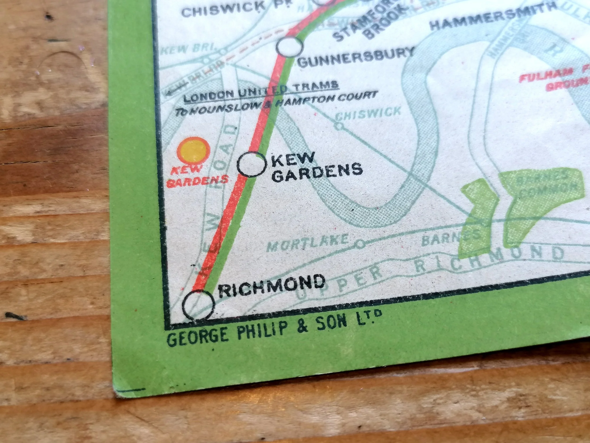
Designed and Printed by George Philip & Son for London Underground Electric Railways. Colour lithograph on paper. Measures 26cm x 20cm. Condition: Very good. some light wear. Folded as issued.
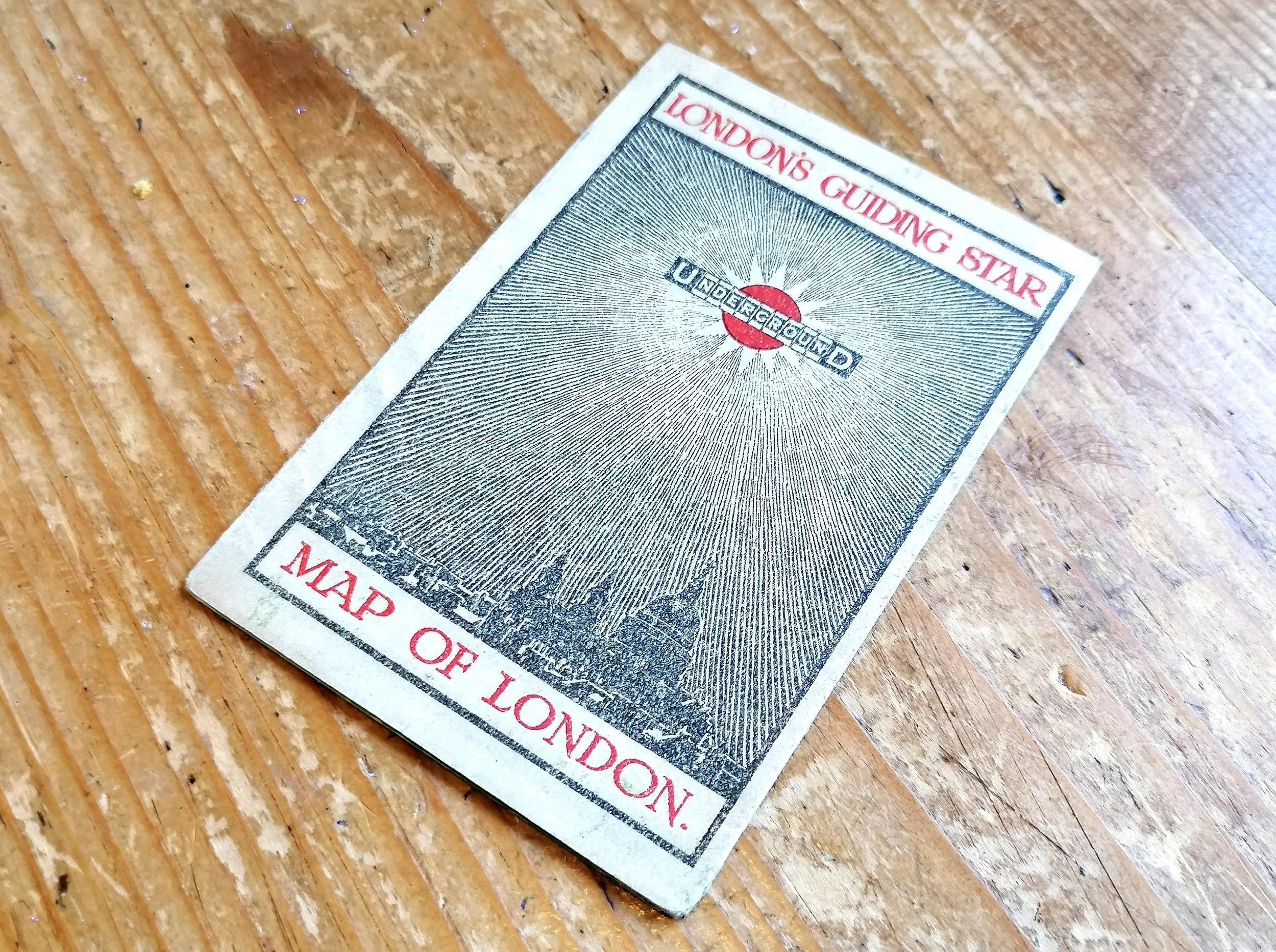
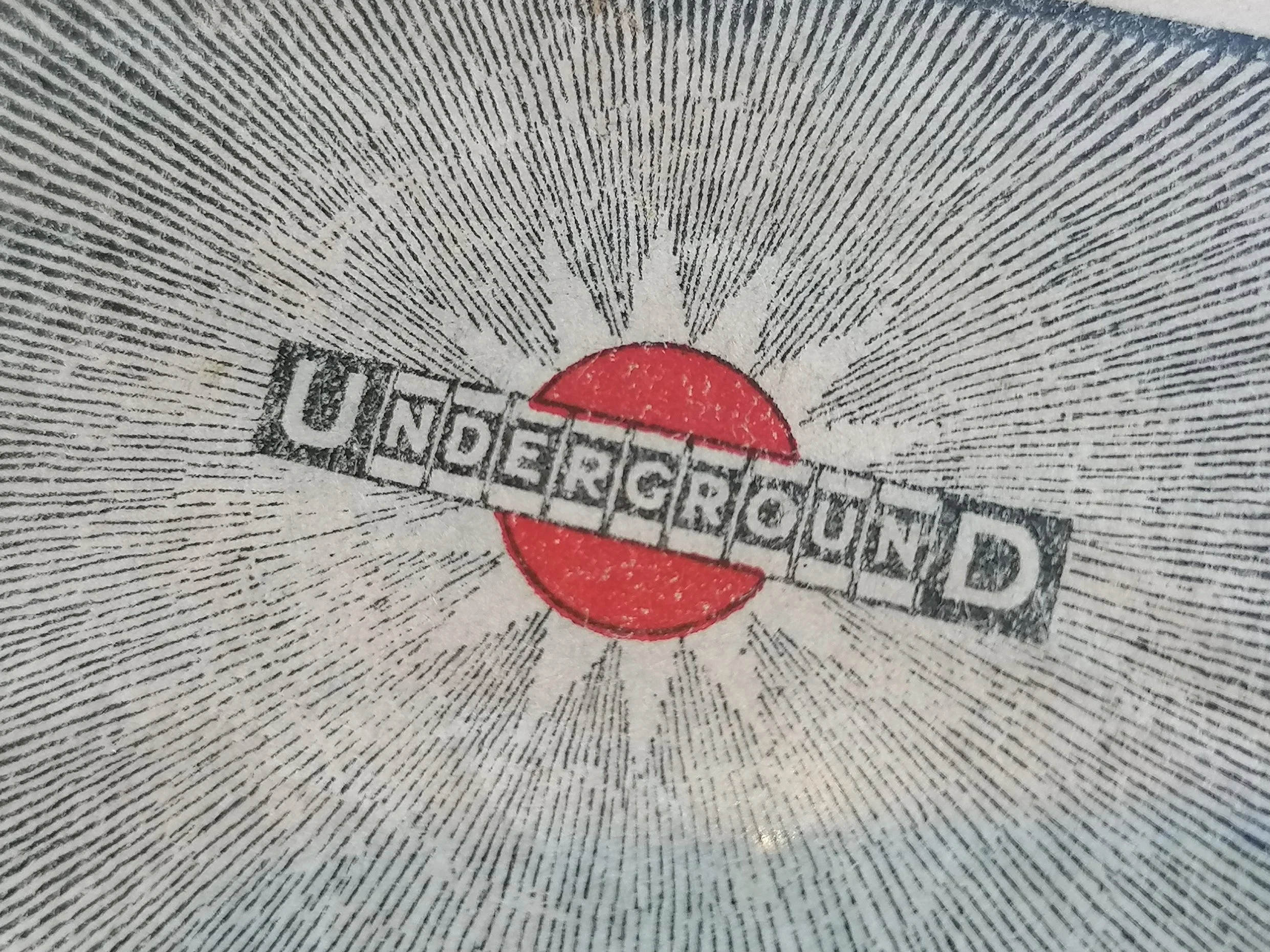
The cover of this London Underground map is widely considered to be the first printed example of the iconic London Underground logo. It shows the Underground logo shining as a ‘guiding star’ above a silhouetted London skyline.
From 1908, platform station signs featured a red disc to make the station name more distinct among the busy advertising hoardings, making them easier to spot from an arriving train. It quickly became a visual symbol of the network and the decision was taken to add it to the UndergrounD wordmark. Following it’s appearance on this map, the logo was rolled out to station signage and posters. After WWI, the new modern ‘Johnston’ typeface replaced the 1908 wordmark and the disc became a ring.
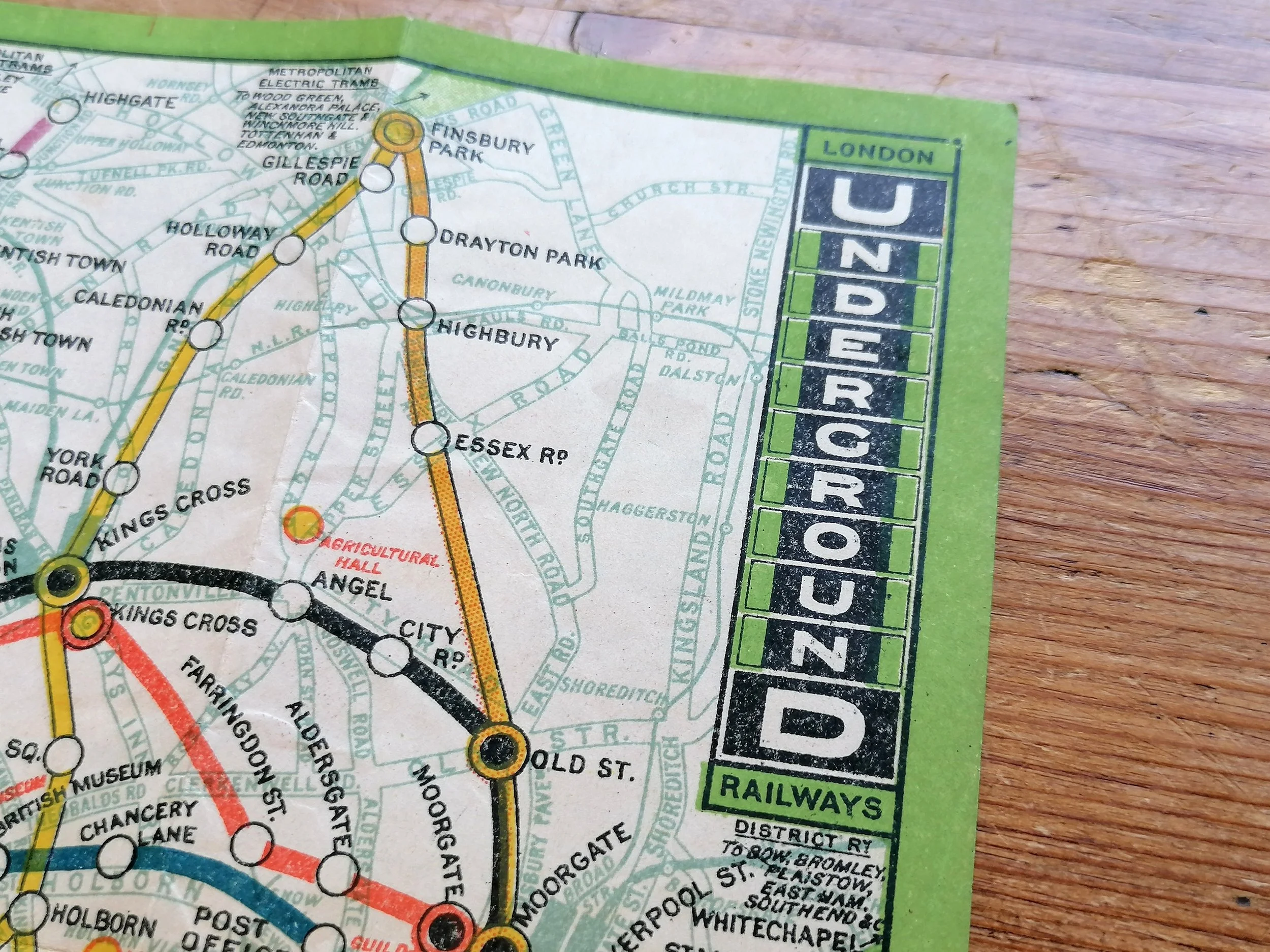
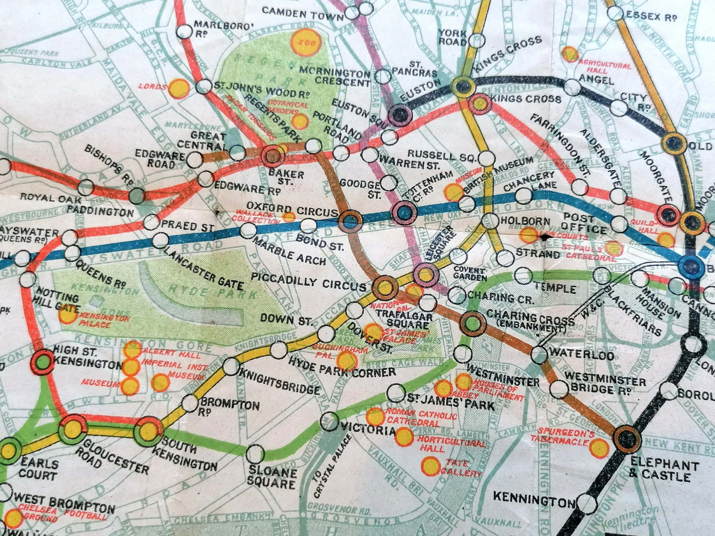
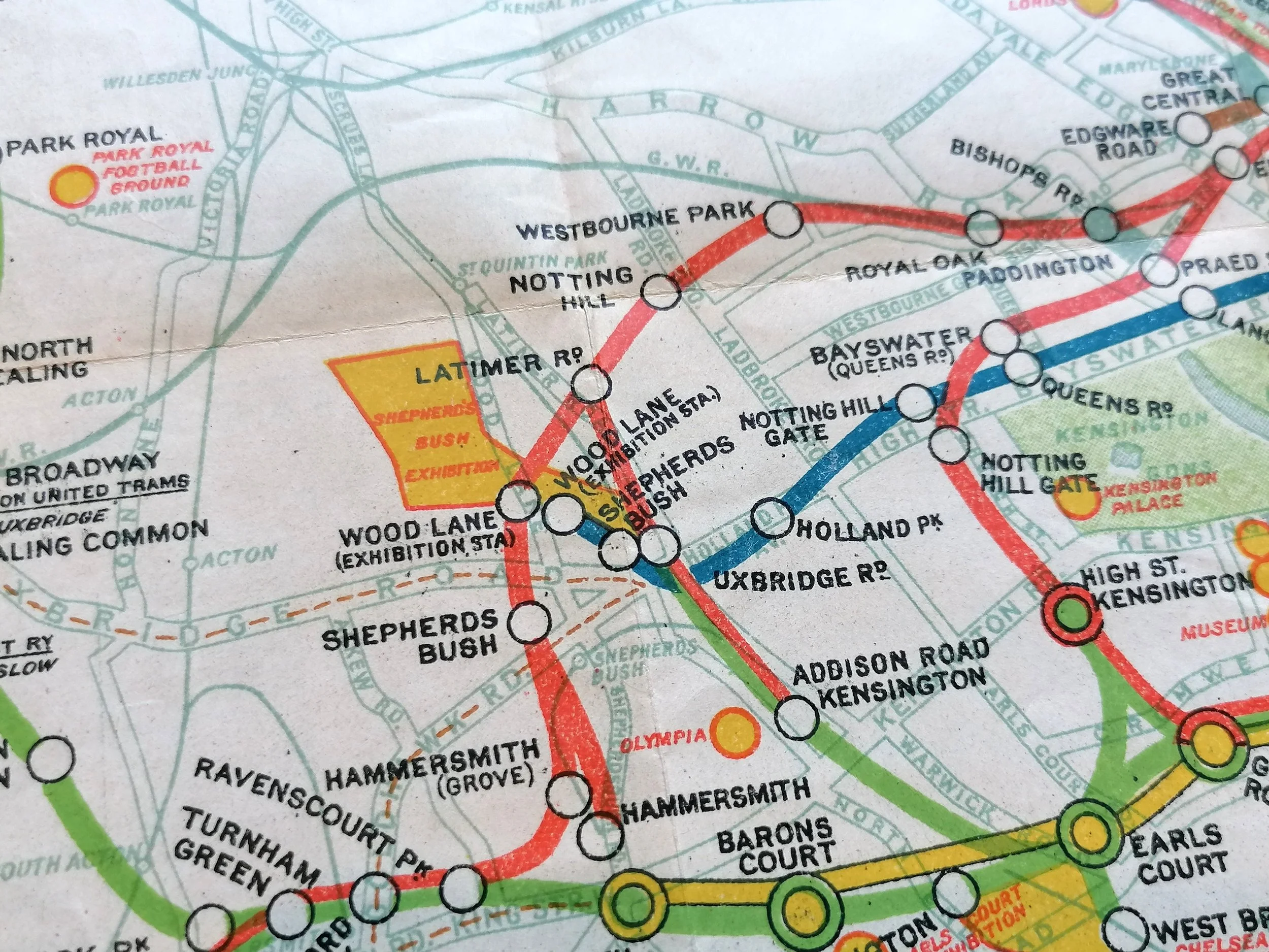
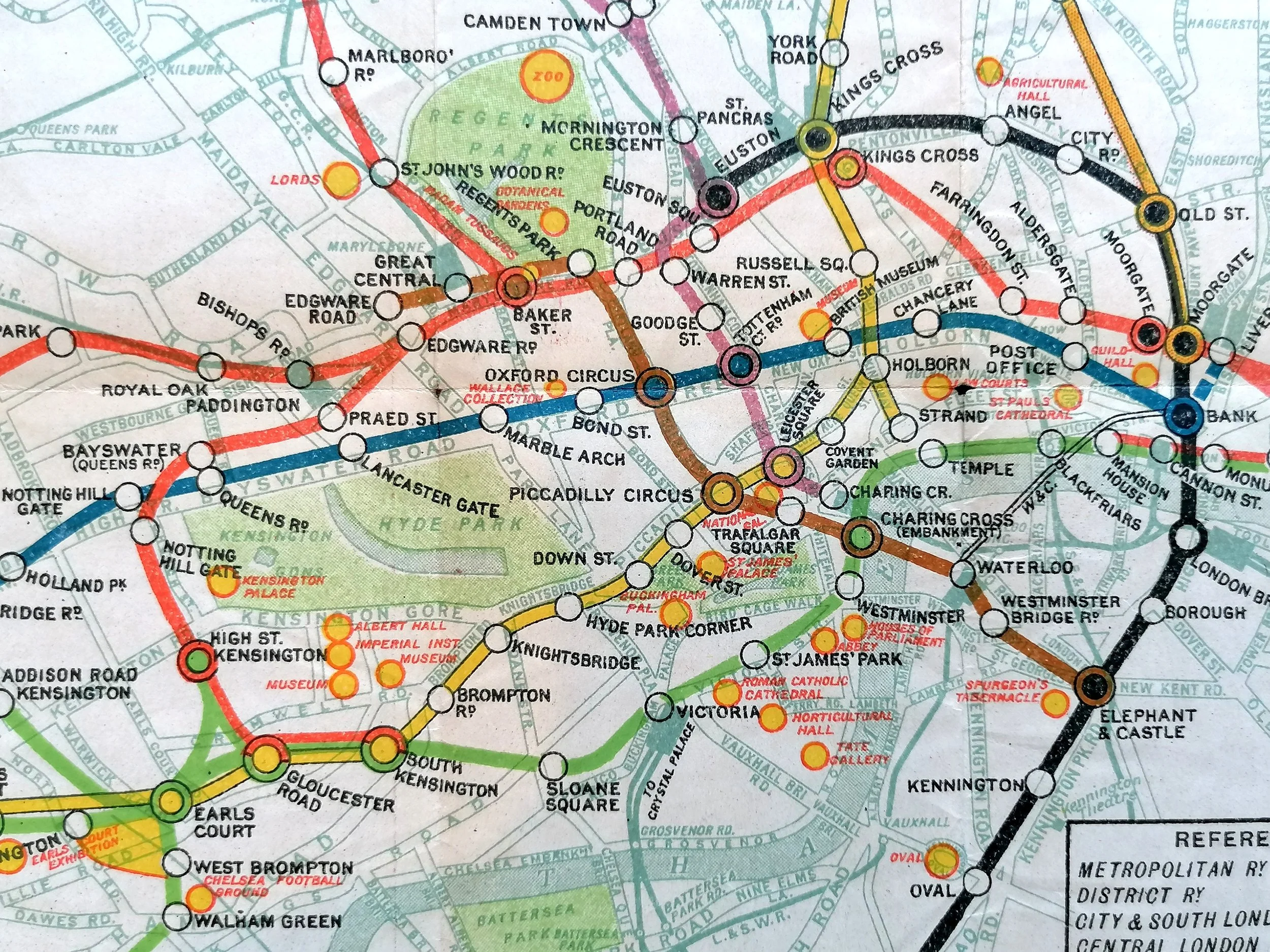
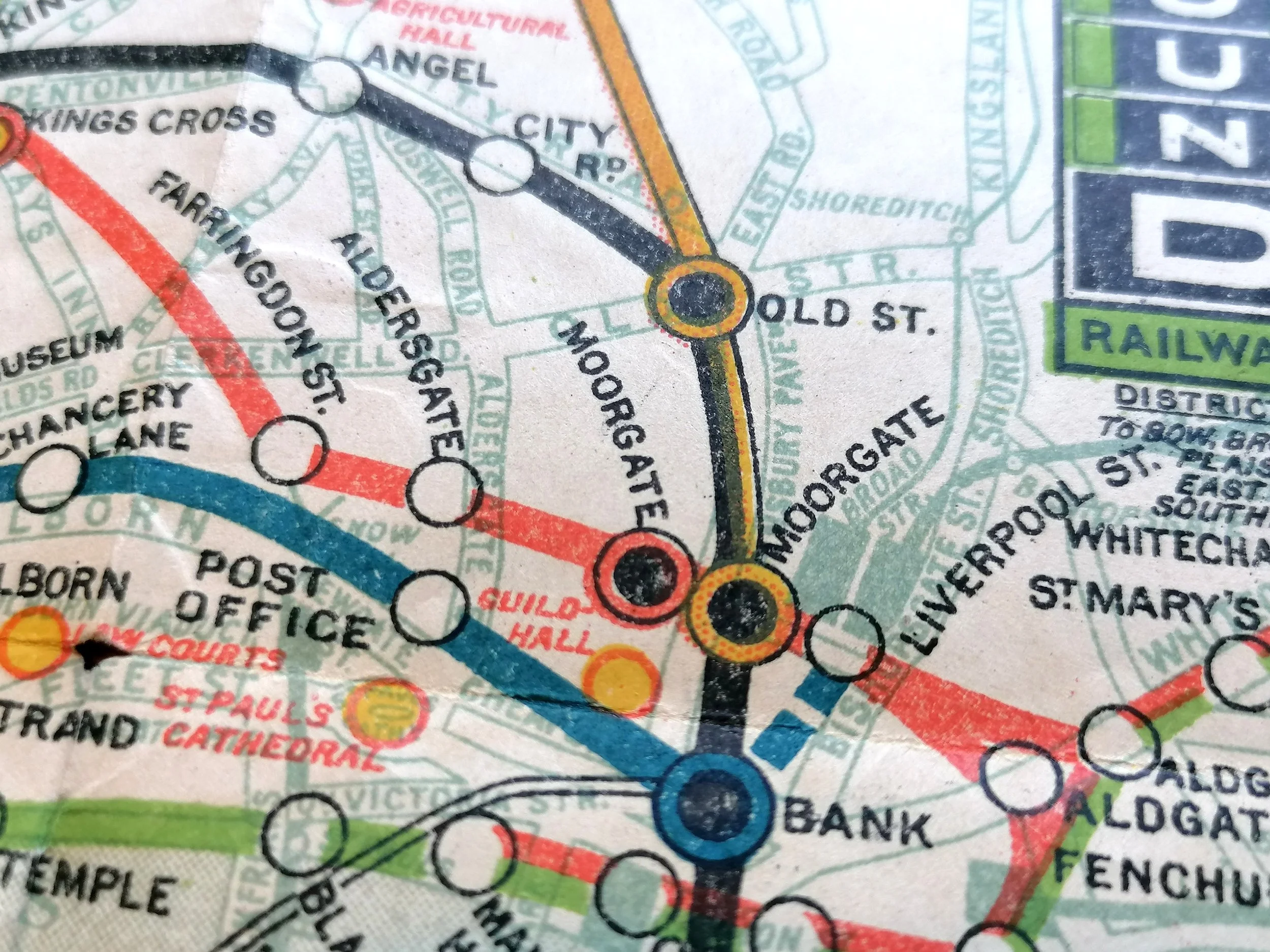
The design of this ‘London Underground Railways’ pocket map used for just one year in 1912 and was adapted from the larger “Evening News Tube Map of London” (also by George Phillip & Sons). The map bears a rarely seen vertical version of the UndergrounD wordmark that was introduced (and almost immediately abandoned) for station signage and occasional printed material. Designed for tourists, this map is littered with yellow icons indicating London's attractions, museums and theatres. It shows the Central London Railway extension between Bank and Liverpool Street under construction advertises the Latin-British exhibition at Shepherd's Bush Exhibition Ground.
FREE UK DELIVERY. Non-UK Delivery available, please request a quotation
London’s Guide Star - Map of London - London Underground Railways
Designed and Printed by George Philip & Son for London Underground Electric Railways. Colour lithograph on paper. Measures 26cm x 20cm. Condition: Very good. some light wear. Folded as issued.
The cover of this London Underground map is widely considered to be the first printed example of the iconic London Underground logo. It shows the Underground logo shining as a ‘guiding star’ above a silhouetted London skyline.
From 1908, platform station signs featured a red disc to make the station name more distinct among the busy advertising hoardings, making them easier to spot from an arriving train. It quickly became a visual symbol of the network and the decision was taken to add it to the UndergrounD wordmark. Following it’s appearance on this map, the logo was rolled out to station signage and posters. After WWI, the new modern ‘Johnston’ typeface replaced the 1908 wordmark and the disc became a ring.
The design of this ‘London Underground Railways’ pocket map used for just one year in 1912 and was adapted from the larger “Evening News Tube Map of London” (also by George Phillip & Sons). The map bears a rarely seen vertical version of the UndergrounD wordmark that was introduced (and almost immediately abandoned) for station signage and occasional printed material. Designed for tourists, this map is littered with yellow icons indicating London's attractions, museums and theatres. It shows the Central London Railway extension between Bank and Liverpool Street under construction advertises the Latin-British exhibition at Shepherd's Bush Exhibition Ground.
FREE UK DELIVERY. Non-UK Delivery available, please request a quotation